UPDATE **ADOBE HAS RETIRED THIS TOOL**
You now have to use the web based color wheel.
Do you ever look at a painting or piece of art and think, “wow, those colors really seem to fit!” and wonder why? Most of us are familiar with complimentary colors and have scene a color wheel, but do you use it in your painting and compositing work flow?
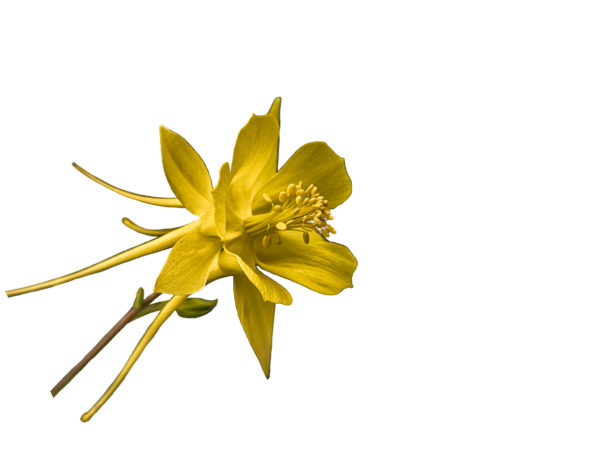
Adobe actually makes the process of picking colors very easy and the extension is built right in your Photoshop! This tutorial is going to give you a quick example of how I used is yesterday to pick the colors to create the background for my next painting of a yellow flower. Let’s get started!
The tool in Photoshop is called the Adobe Color Theme and you can find it here:
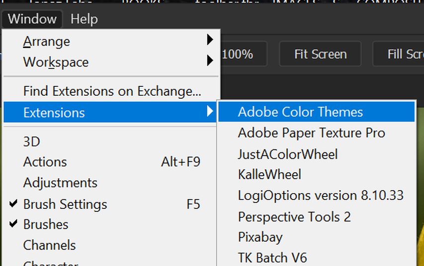
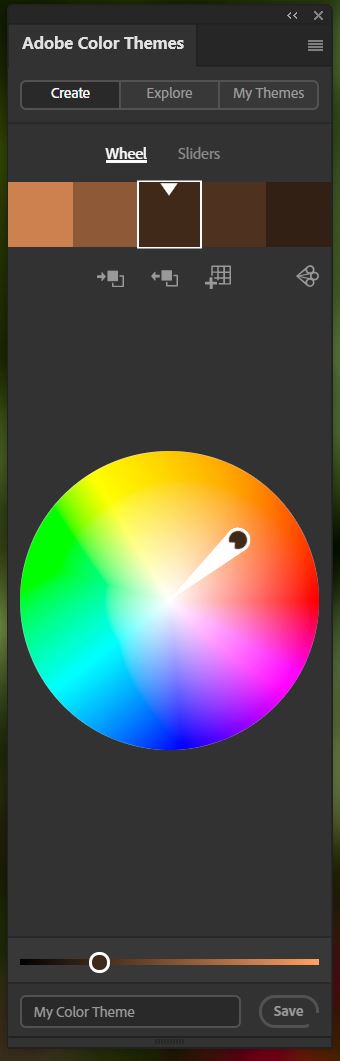
When you click on the extension, you will get a panel that looks like this.
This tool has MANY other options other than just applying the color rules that I will review here. So feel free to explore the library of color themes it offers as well. I will not be covering all the features of Adobe Color Theme in this article, just the application of the color rules.
The concept behind the color rules is to pick the primary color you want to work with. For this tutorial, I am getting ready to paint this yellow columbine, so I used the eyedropper tool and picked one of the light to medium yellow colors from the flower. The eyedropper puts that yellow color as the foreground color on my color panel. (usually set to black and white).
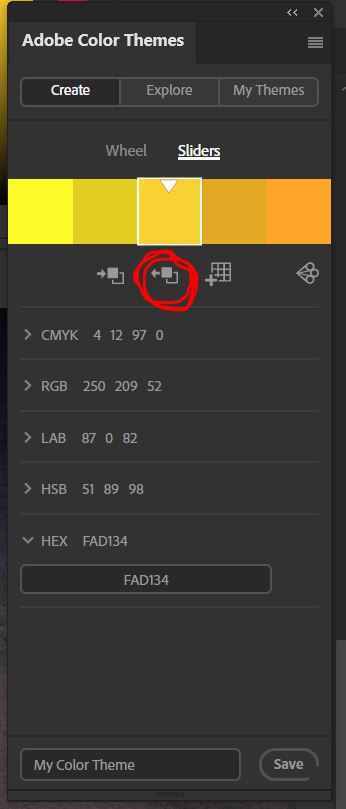
Once you have the primary color on your foreground, you can click on the second icon, when you hover it says “set selected color from active color.” Your foreground color will now go in the center of the 5 colors on the adobe color theme panel.
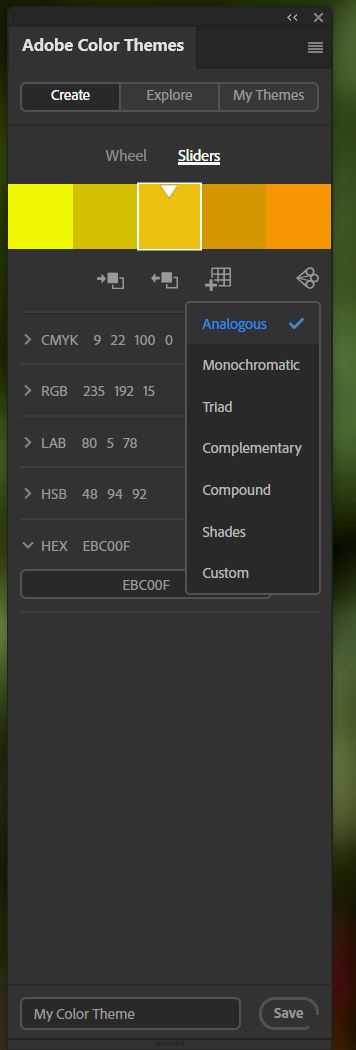
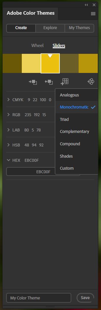
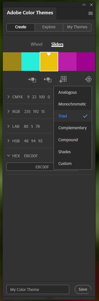
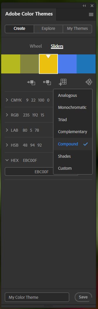
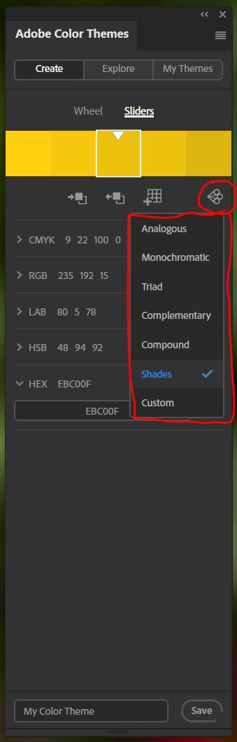
**Note above the 5 color panel are the words, Wheel and Sliders. You can work in either mode. For my examples, I was in the sliders mode so I could see the codes. I actually entered the HEX code color from my foreground color when I started. Either mode will work for the application of the color rules.
The benefit of this tool is the color rules which is the last little icon in the row, the one with the three little circles. When you open this drop-down, you get a list of color rules. By clicking on each, you get a set of 4 additional colors (two on either side of your primary color) that fit that rule. Here are the results of the six rules applied to my original color of EBC00F

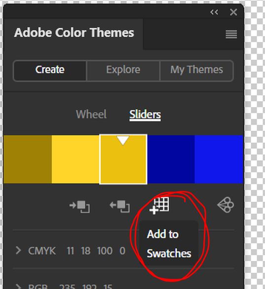
GETTING THE COLOR INTO PHOTOSHOP
The next obvious question would be, how do I get those colors into Photoshop so I can reference them for my painting and compositing.
Well, there is a button for that! AFTER each rule is applied, click on the the third icon, the one with the little grid which says “add to swatches. Each set from the rules will add to the bottom of your swatches. You could export and save this group of colors to a custom swatch with the name of the painting you are working on if you wanted to keep it for future reference.
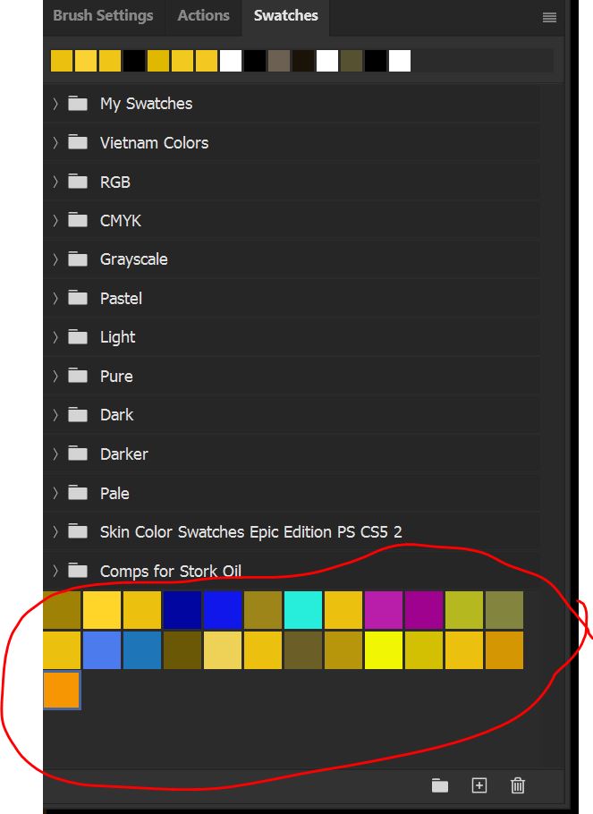
USING THE INFORMATION
So how did I use the information I downloaded from the Adobe Color Theme? Well, I decided to make my background using the dark blues. I know that blue is complimentary to yellow. But I liked the fact that pink was a triad color too. So here is what I did with that knowledge. Here is the background I built that will eventually be behind the yellow flower painting.

Here are the images that I used to build my background and a view of my panel to build it:


Hope you found this tutorial helpful! Let’s go paint!
#terributlerphotography,#digital_art, #fine_art, #prints, #tutorial, #art, #photomanipulation, #lesson, #mixerbrush, #mixer, #Photoshop, #painting, #photocomposite,#https://fineartamerica.com/profiles/terri-butler, #https://terributlerphotography.com/galleries-landing/, #http://shutterstock.com/g/terributlerphotography/sets, #https://stock.adobe.com/contributor/206561680/Terri
