I started a new composite yesterday. I found some cool 3D elf images on one of my stock sites and a dragon so I decided to put together a composite of one of my favorite series, the Lord of the Rings! This one is about Rivendell, the throne of the elf king.
I found a bunch of my images and a couple of stock pieces, 12 images in all, and added them together into this scene. But as you can see, they are all in different color temperatures. So the image really looks like a mess. So the first thing I have to do before I begin with painting or lighting or even adjusting the elements to fit the depth of field is to get them all into the same color palette. The tool I use for this task is a color balance adjustment and I use a an ambient light check layer that shows me what the scene looks like in just colors so that I can easily see what to adjust on each element.
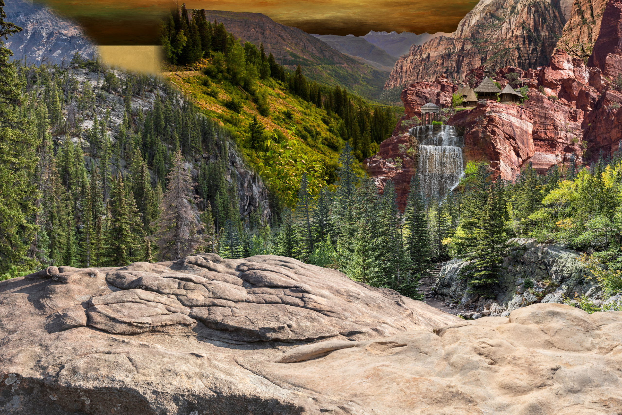
Here is what it looked like before I began making my color adjustments. Pretty ugly!
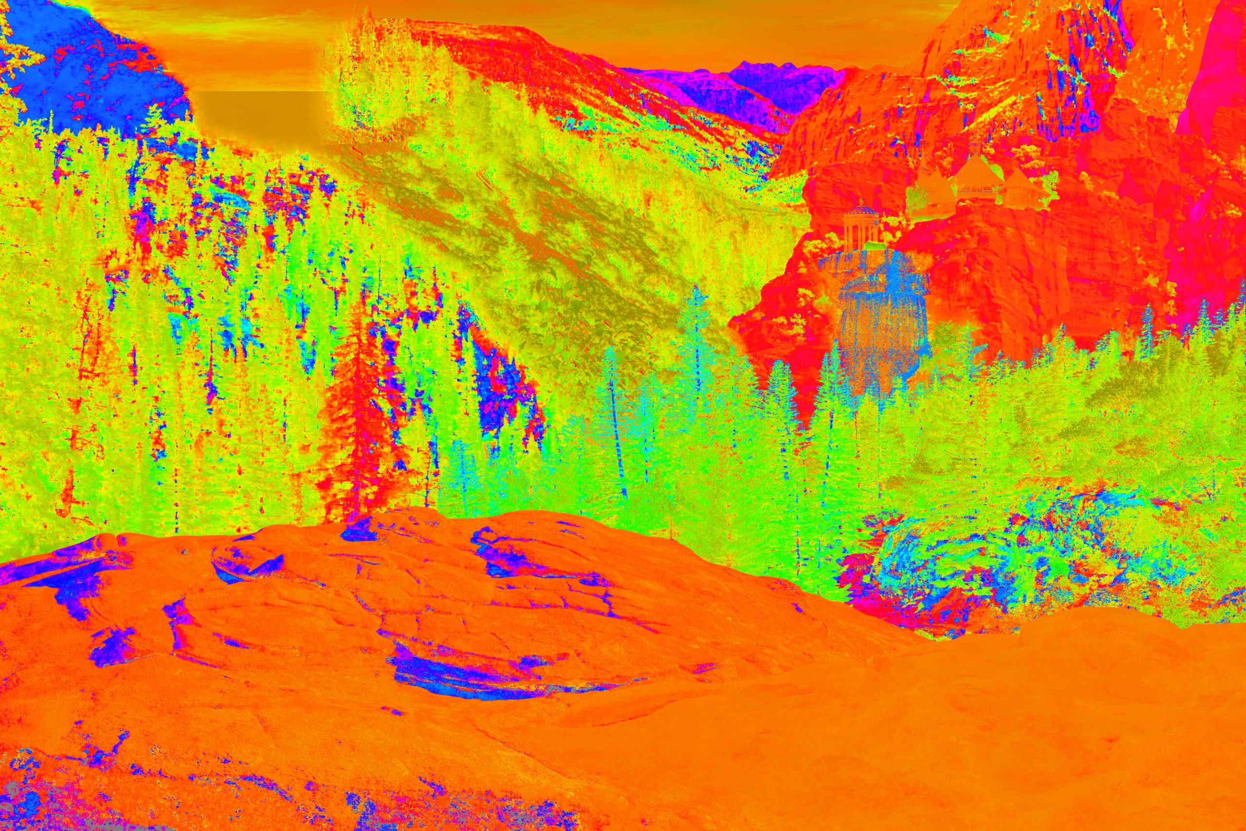
Here is what the color map looks like with the ambient light check layer.
I added an adjustment to each element and began adjusting the mid tones, shadows and highlights to make each element look the same and kept checking the colors on the ambient light check layer to ensure that trees across each element for example were the same, and rocks were the same, etc.
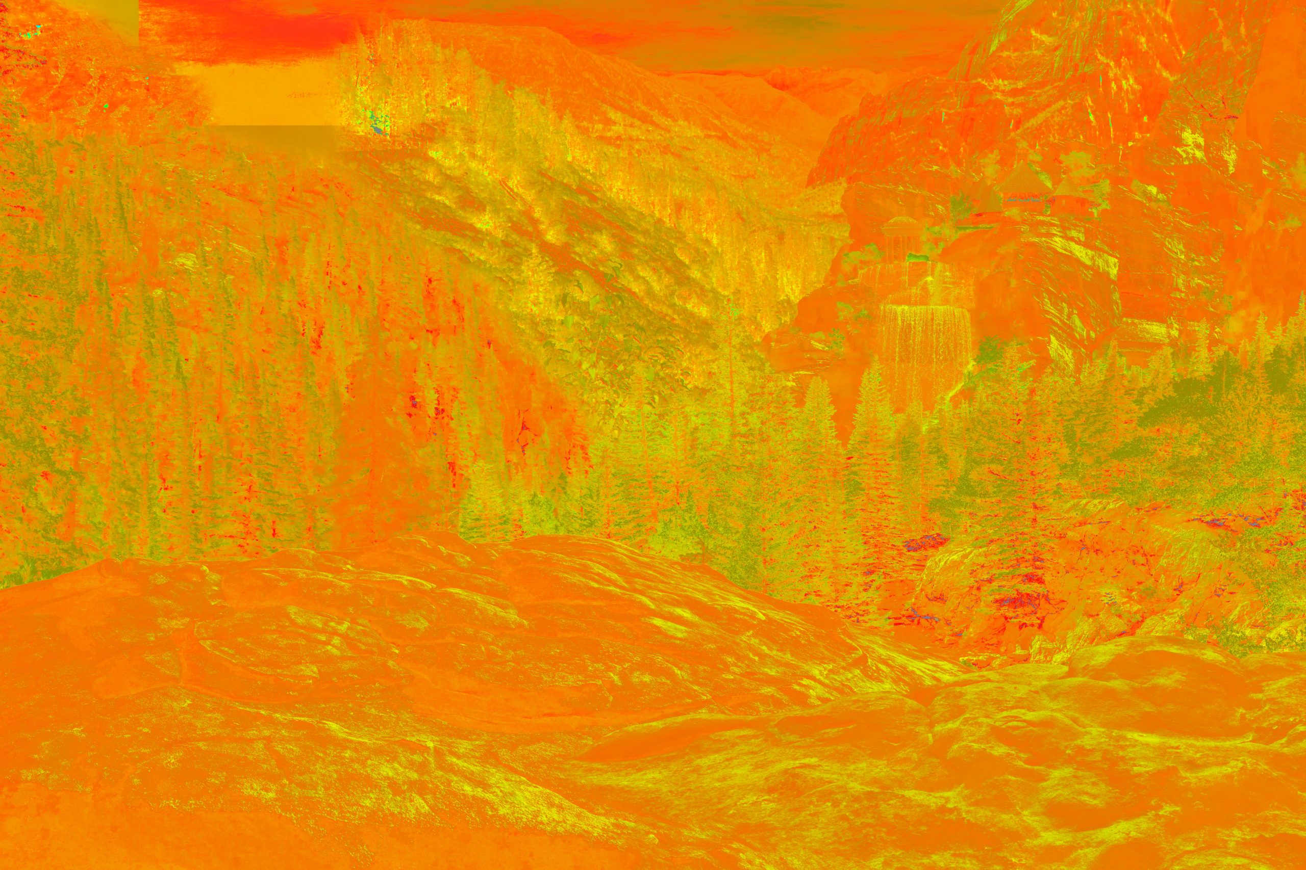
Here is the final color map and final image.
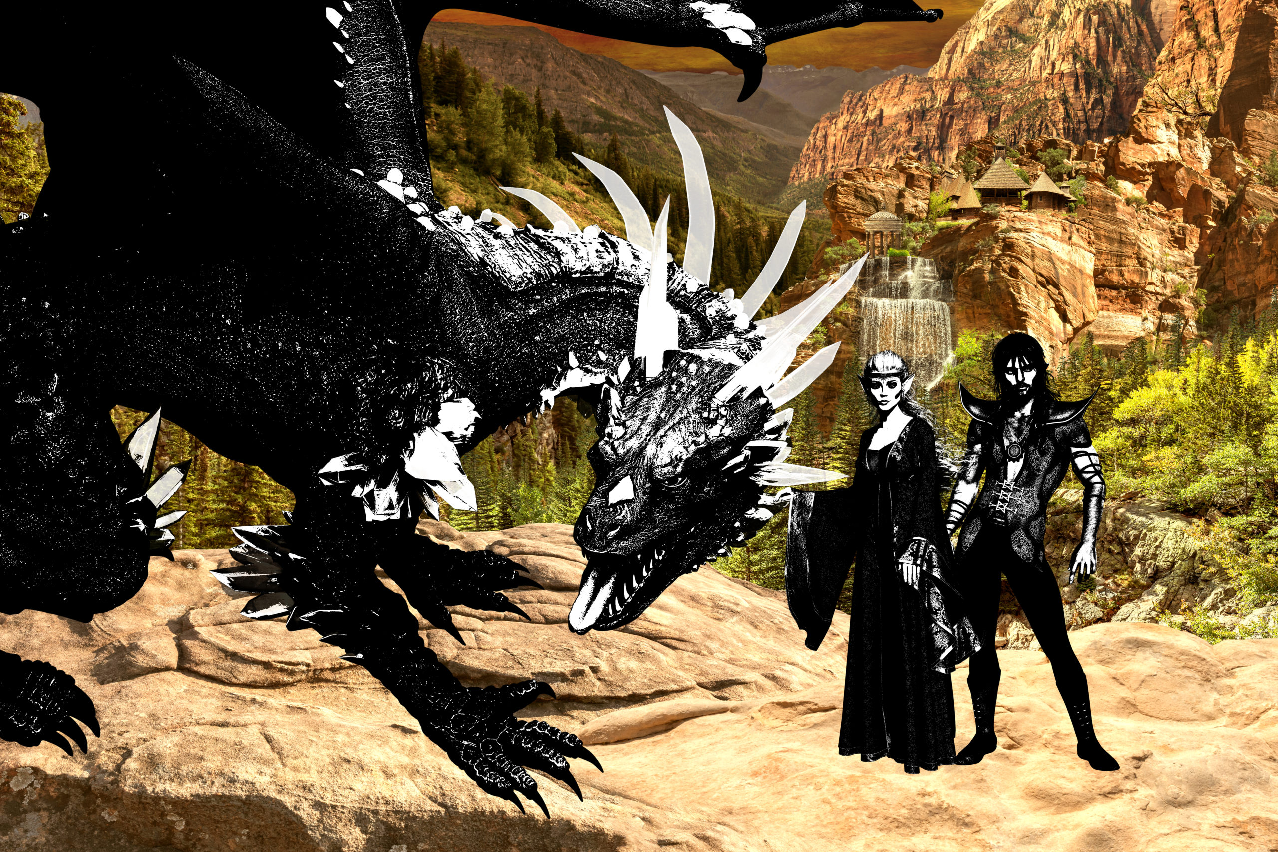
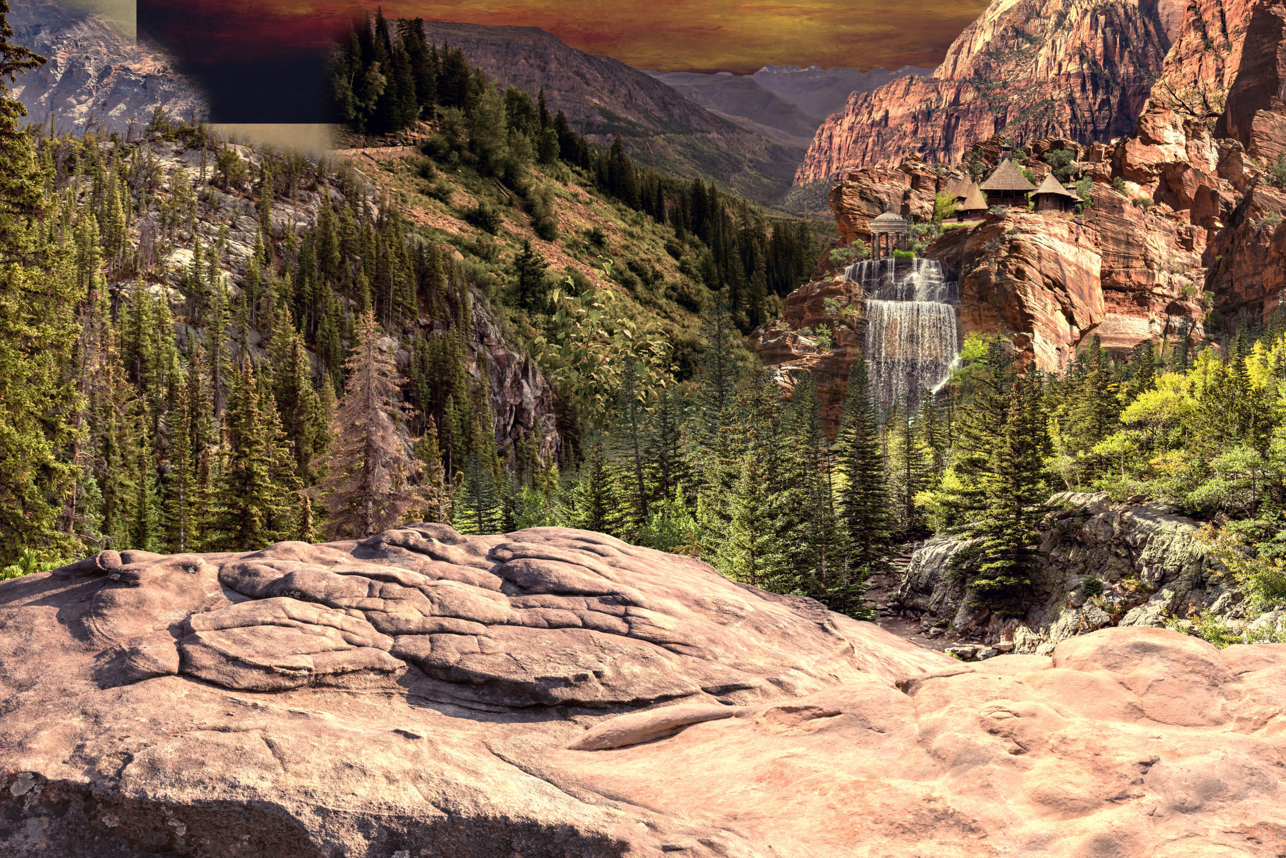
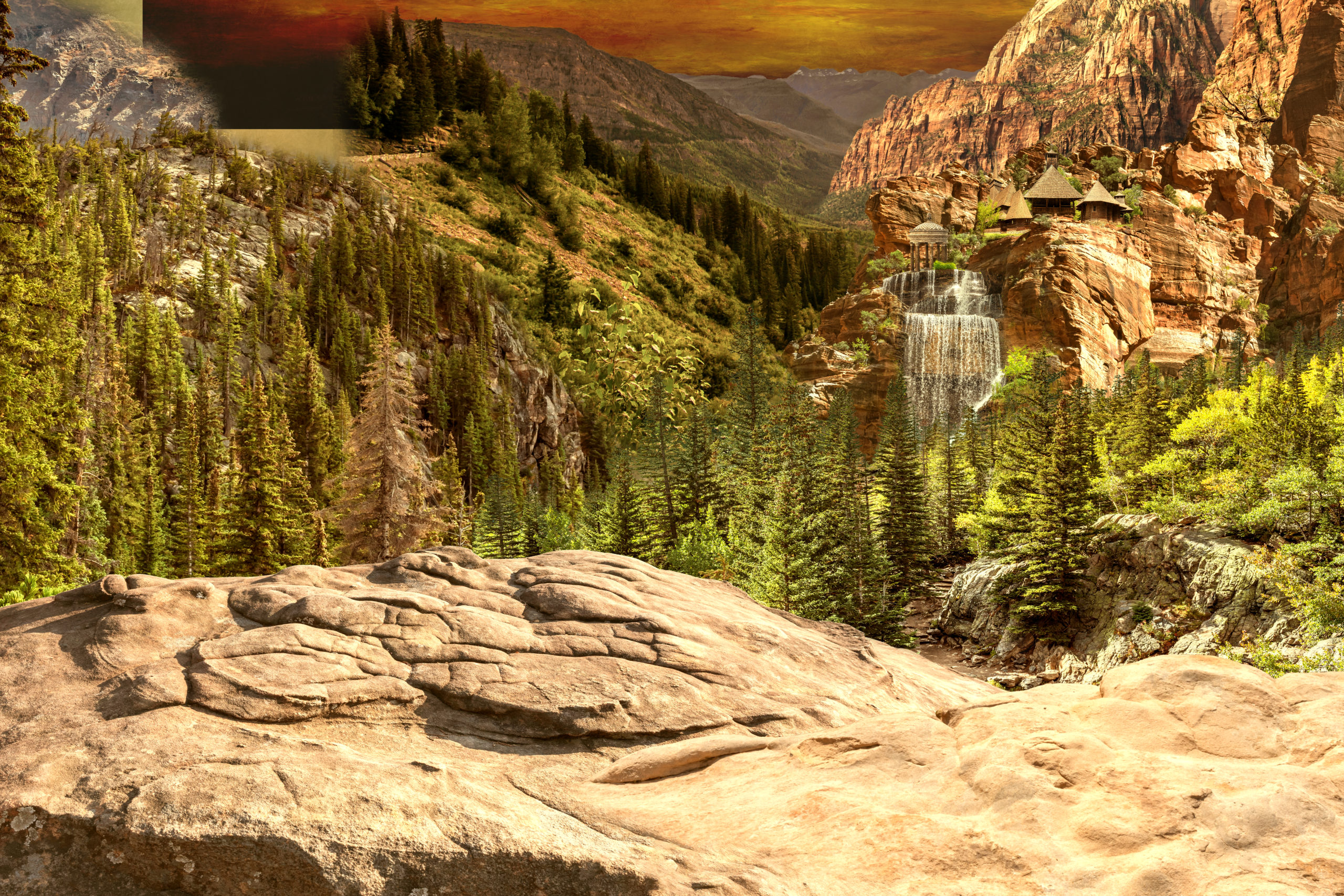 Here is the final image with my mockup of the dragon and elves.
Now I can move on to painting and lighting the background elements to get the light correct. I will be coming from the right as most of the rocks have light on the right and this will be the easiest to emulate. Then I can move to cleaning and blending edges and pushing the distant elements into the background and adding the environmental factors such as haze or fog or anything that give the depth to the valley. Once all that is finish I can blend it all together with a color overlay and move on to painting my foreground figures.
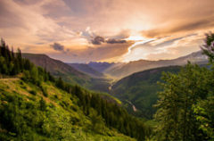
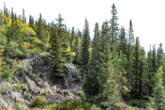
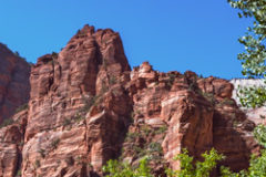
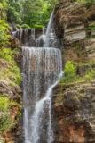
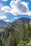
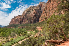
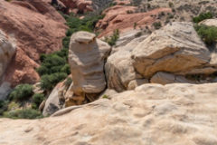
Here are the 12 images I used to build the background, except for the texture that is the sky in the background.
So the overall background is probably way too warm right now, but at least all the elements are in the same palette and easily changed with just one color balance or a color lookup table adjustment layer.
Here is an adjustment to cool the entire scene back down. One color balance over the entire group of layers and a 48% application of Milo 5 LUT.
I exported my ambient light action into a share folder and it is available here to download it and try it. After download, just click on the .atn file and it will automatically load itself to your Photoshop action folder. If you don’t like it, just drag it to your trash in Photoshop.
Have fun!
Galleries: The Pixel Mixer. Fine Art America.
My Stock Profiles: Shutterstock. Adobe Stock. Dreamstime
#digitalart #art #artist #artwork #fanart #digitaldrawing #digitalillustration #digitalpainting #digitalartist #painting #photoshop #digitalartwork #compositing
#photomanipulation #creative #photoediting #photoshopart #digitalmanipulation #prints
