Today with all the AI applications available to create digital art, and the commercial actions for sale, you often wonder what you are looking at on Facebook and Instagram. Did the artist paint something or make decisions about the art? Or did they just type some text or push a button?
While I find the AI art renderings interesting for some composite work, I still want to make my digital art uniquely mine and ensure that every image I work on is different and special. I might automate a few steps that I repeat many times and input stops to allow myself to make adjustments to filter settings, but I don’t blindly run commercial actions and accept the results as “artwork.”
Today I’m going to show you a watercolor technique that I’ve been working on. It involves several steps to include (1) building the background or underpainting, (2) making the watercolor with several different steps and then some finishing techniques.
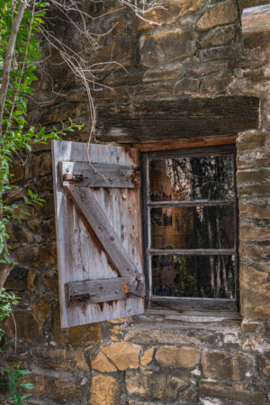
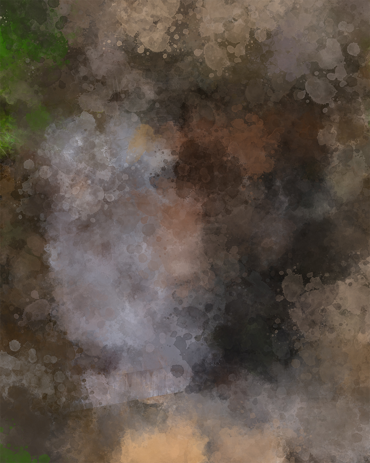
This is the before and after images:
|
|
 |
BACKGROUND
To complete the background, I used a technique of painting with the pattern stamp tool in the impression mode using a watercolor brush. You make visible the original image and then define it as a pattern. If our pattern stamp tool is selected, you can make this pattern active with the drop down box at the end of the toolbar.

Next to the image on the tool bar, check the box marked “Impressionist”. With your pattern stamp tool selected, load any watercolor brush tip to the tool. If the brush is already defined as a paint brush (it has the little drop of paint) just hold the Ctrl+Alt key down and click on the brush and the tip settings will load to your pattern stamp brush. (make sure you have your pattern stamp tool selected before holding down the keys)

Just cover the entire image with a painterly feel. This will be your base layer, at normal 100 opacity.
THE WATERCOLOR
The first step is to depixelate the image. We don’t want it look like a photograph. I have a couple different technique for this depending on the image, the subject and what I plan to paint, but for this image, here is the formula I used. I put this in a smart object so I could make adjustments along the way. These are the final settings and opacities.
Run the Accented Edges filter with 8, 25, 15 settings (adjust for your image as needed) leave at normal 100%
Then run the Diffused Glow filter at 6, 10, 15 and put it in Overlay 60%
Then run Photocopy 20 and 35 and put in the Soft Light at about 11%
The second step is to make the luminosity ranges which you can then put into various blend modes and opacities to add depth to the artwork I used the Watercolor image that was the result of the filter step above and made several Color Range selections and put them on their own layers.
Color Range allows you to select Highlight, Midtones and Shadows. I have built my own ranges to spread this to 4 sets. This gives me more diversity in my midtones. You can also build your ranges and save them yourself. My settings are Shadows 0-55, Low Mids 45-128, High Mids 118-200 and Highlights 190 up. This ensures some overlap and that all the pixels will be on one of the four watercolor layers. Four times I select this Watercolor image, select one of these ranges, make the selection and move that selection to its own layer.
With these four layers above my settings are Highlights Multiply 82%, High Mids, Liner Burn 35%, Low Mids Overlay 50% and Shadows Normal 50%.
EVERY IMAGE WILL VARY.. you must experiment based on your image luminosity and colors.
The third step in the watercolor technique is some lines. Now you can do this step with either a Black and White copy of your image if you want strong lines, or you can use a colored copy of the original image for colored lines.. it really doesn’t matter… it depends on your image and the look you want. I used a colored copy of my image for this sample. Convert to B&W if you want black lines.
Make two copies of your image and put them in a folder and label it LINES. The bottom image will stay normal 100. The top image you are going to:
- Convert to a Smart Object
- Put the image in the Color Dodge mode
- Invert the image (it should look like a negative)
- Run Gaussian Blur – put the settings somewhere between 3 -15 depending on your image. You can always adjust later.
- Now put the FOLDER’S blend mode in multiply and adjust the opacity – mine is 68% for this artwork.
The final touch on the watercolor is to add some brush splatter. Again this technique varies with your image. It isn’t really visible on this dark image but shows vary nicely on light images and florals. This is called brush stroking a path and you can decide to add it or not.
If you have a primary object in your image, like the window (or maybe a flower), make a rough selection of it from your original. It doesn’t need to be perfect, we are just using it as general path. Save and name the selection just in case we need it again.
With the selection active, CONVERT IT TO A PATH using Make Work Path.

You can now use transform and make the path a little bigger around the main subject, pulling it out about ½ inch from it’s original border. This is the diameter of the splash we are going to add.
Add a blank layer and make it active.
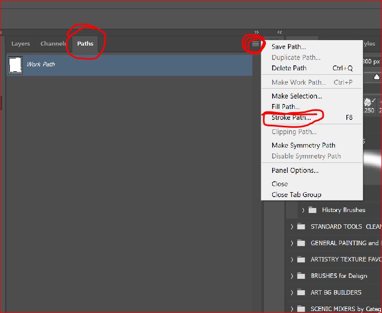
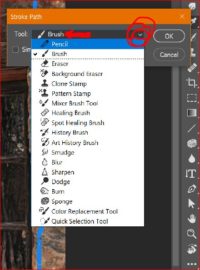
Now we are going to stroke the path with a watercolor brush. The command is on the PATH panel menu. Because I’m using this often I’ve assigned a shortcut key of F8. Select the command stroke path. It will default to the last tool used, in my case the brush. But if you open the drop down you will see you can stroke a path with many different tools.
![]()
Now we are going to stroke the path with a watercolor brush. The command is on the PATH panel menu. Because I’m using this often I’ve assigned a shortcut key of F8. Select the command stroke path. It will default to the last tool used, in my case the brush. But if you open the drop down you will see you can stroke a path with many different tools.
You can also use more than one brush and do it a couple of times. I used a splash brush and then a small dot splatter brush. Mask the splatter off of the your main subject as needed.
FINISHED
I finished the work off with some dynamic lighting produced with levels, a colored LUT, and then a couple of paper textures in soft light at very low opacities.
WOULD YOU LIKE A LINK TO THE LAYERED PSD FILE?
Subscribe to the blog (in the footer or top right) and send my your email and I will send you a link. No formal registration on my site, but only sharing the actual file with artist that I know really want to understand the process.
Galleries: The Pixel Mixer. Fine Art America.
My Stock Profiles: Shutterstock. Adobe Stock. Dreamstime
#digitalart #art #artist #artwork #fanart #digitaldrawing #digitalillustration #digitalpainting #digitalartist #painting #photoshop #digitalartwork #compositing
#photomanipulation #creative #photoediting #photoshopart #digitalmanipulation #prints
